Brand Identity Design for So-Fit
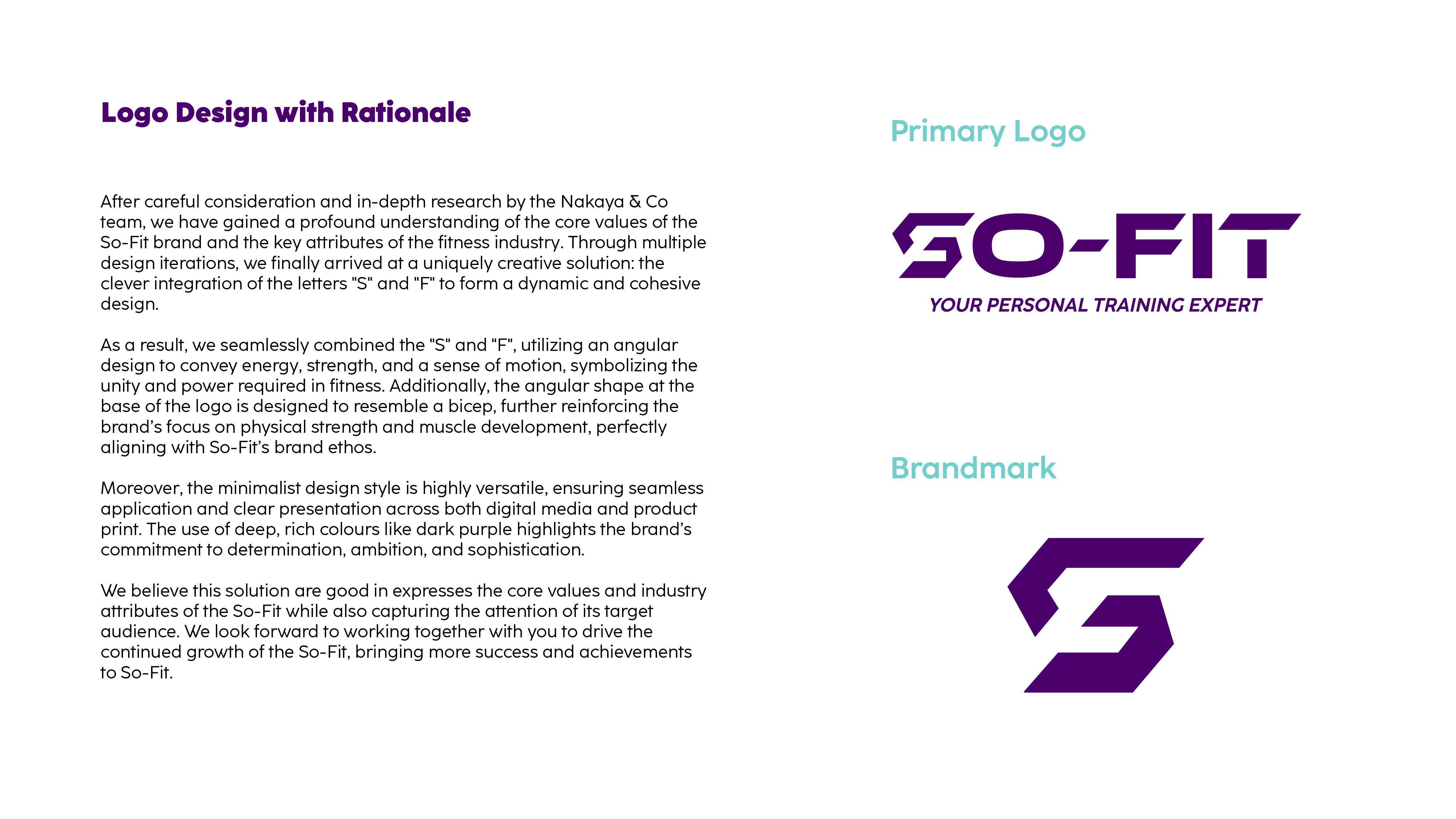
Nakaya & Co. is honoured to have been invited to create a new brand visual identity for So-Fit. After extensive research and multiple discussions, we developed a deep understanding of So-Fit’s core values and the key attributes of the fitness industry. Through several design iterations, we ultimately arrived at a uniquely creative solution—seamlessly integrating the letters ‘S’ and ‘F’ into a dynamic and powerful logo design.
By carefully crafting the design, we merged the ‘S’ and ‘F’ into a cohesive form, utilising sharp, angular elements to convey energy, strength, and movement, reflecting the determination and resilience required in fitness. Additionally, the angular shape at the base of the logo is inspired by the bicep, reinforcing So-Fit’s focus on physical strength and muscle development. This thoughtful approach ensures the logo is both distinctive and perfectly aligned with the brand’s ethos.
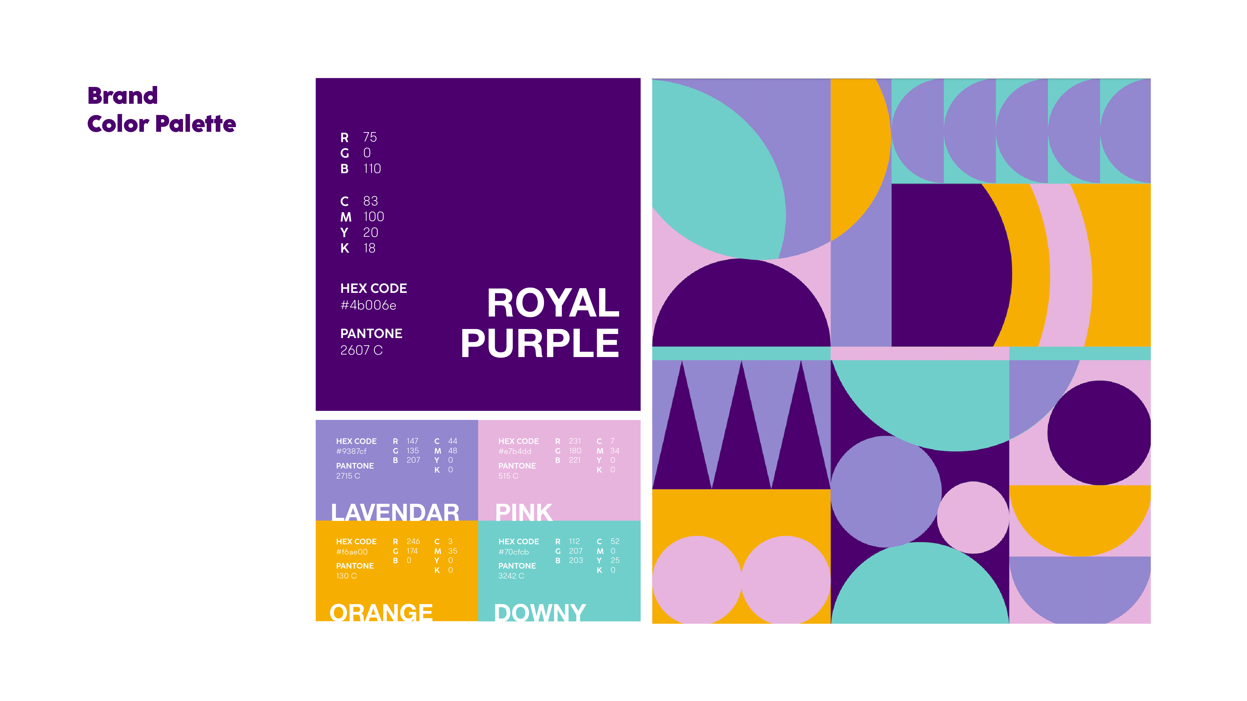
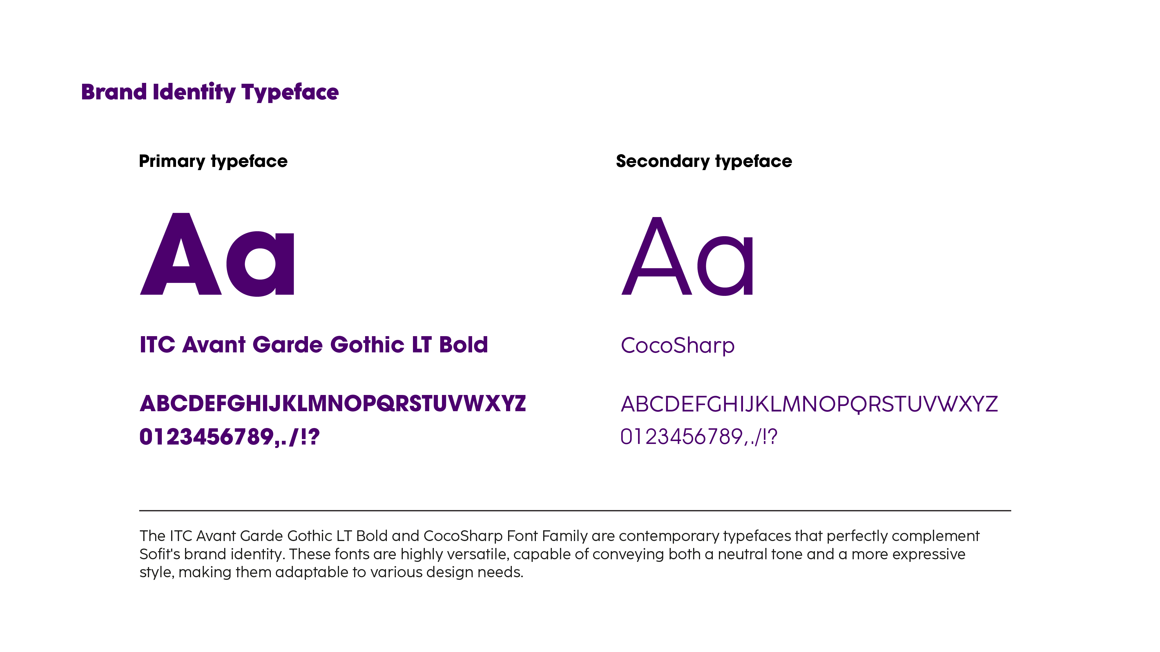
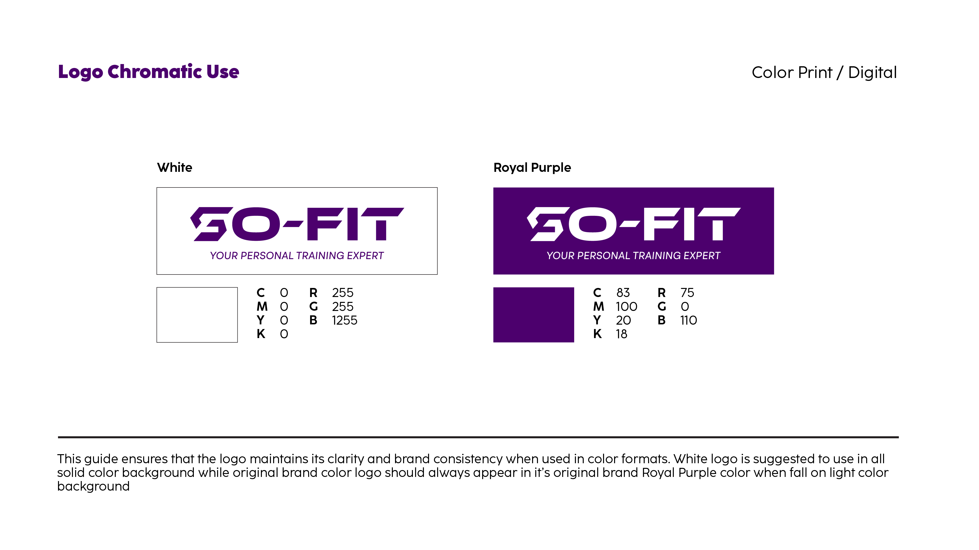
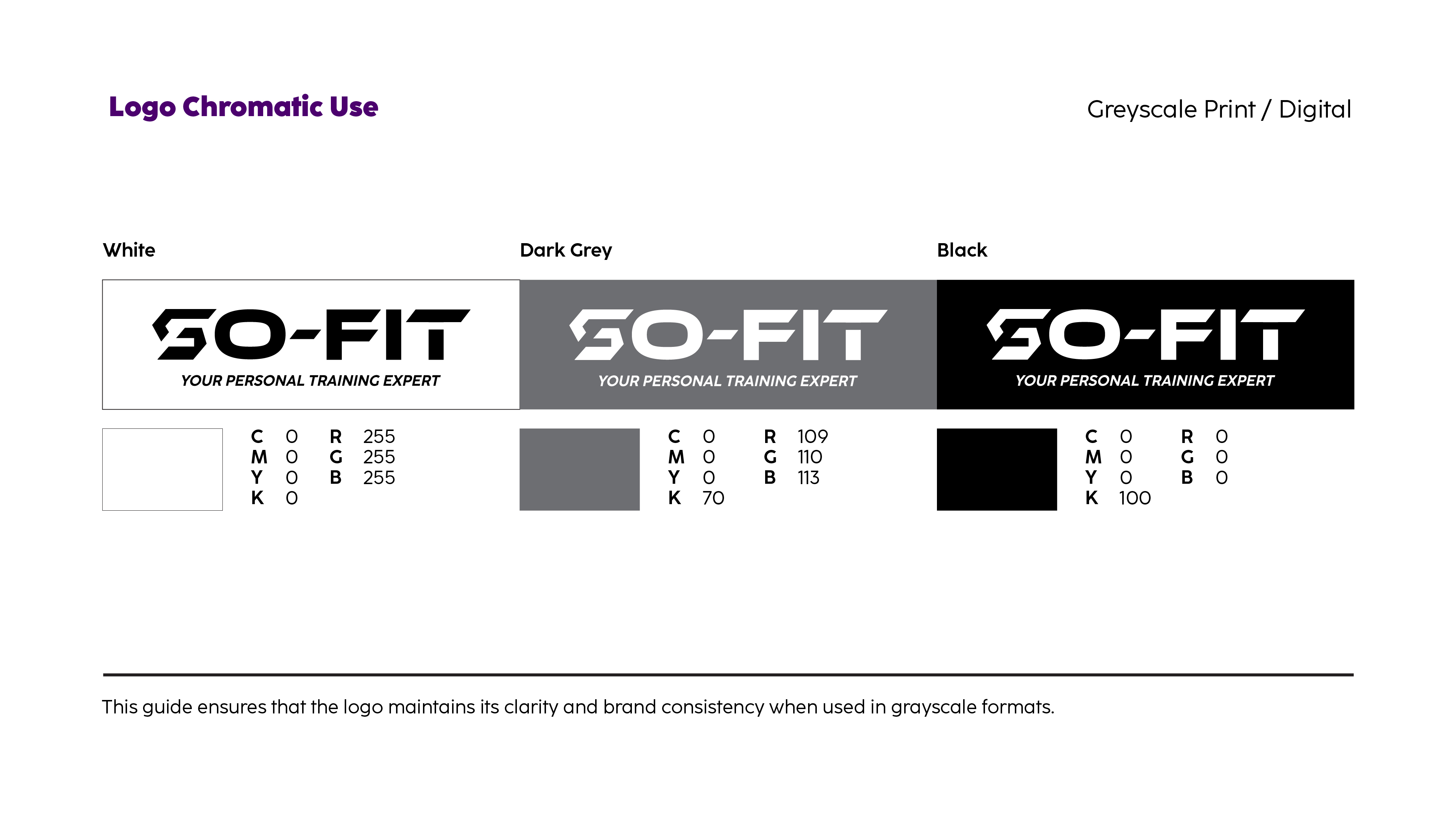
Furthermore, we adopted a minimalist design style, ensuring clear visibility and versatility across both digital media and physical applications. The deep, rich purple we selected symbolises determination, ambition, and sophistication, reinforcing So-Fit’s identity as a bold yet refined fitness brand.
This design not only encapsulates So-Fit’s brand philosophy and industry relevance but also enhances its appeal to the target audience. We believe this refined and impactful visual identity will support So-Fit’s continued growth, expanding its market presence and driving future success.
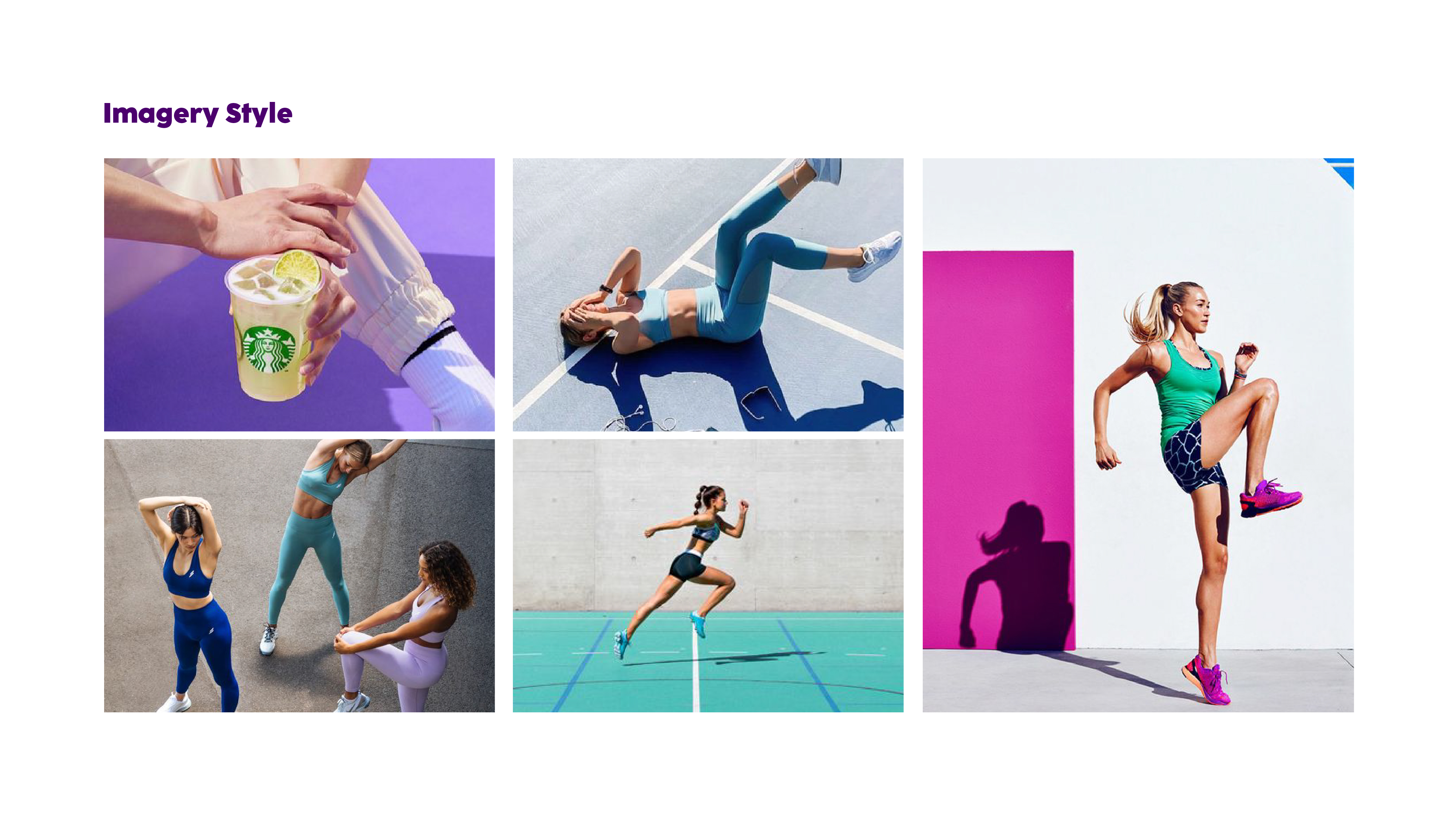
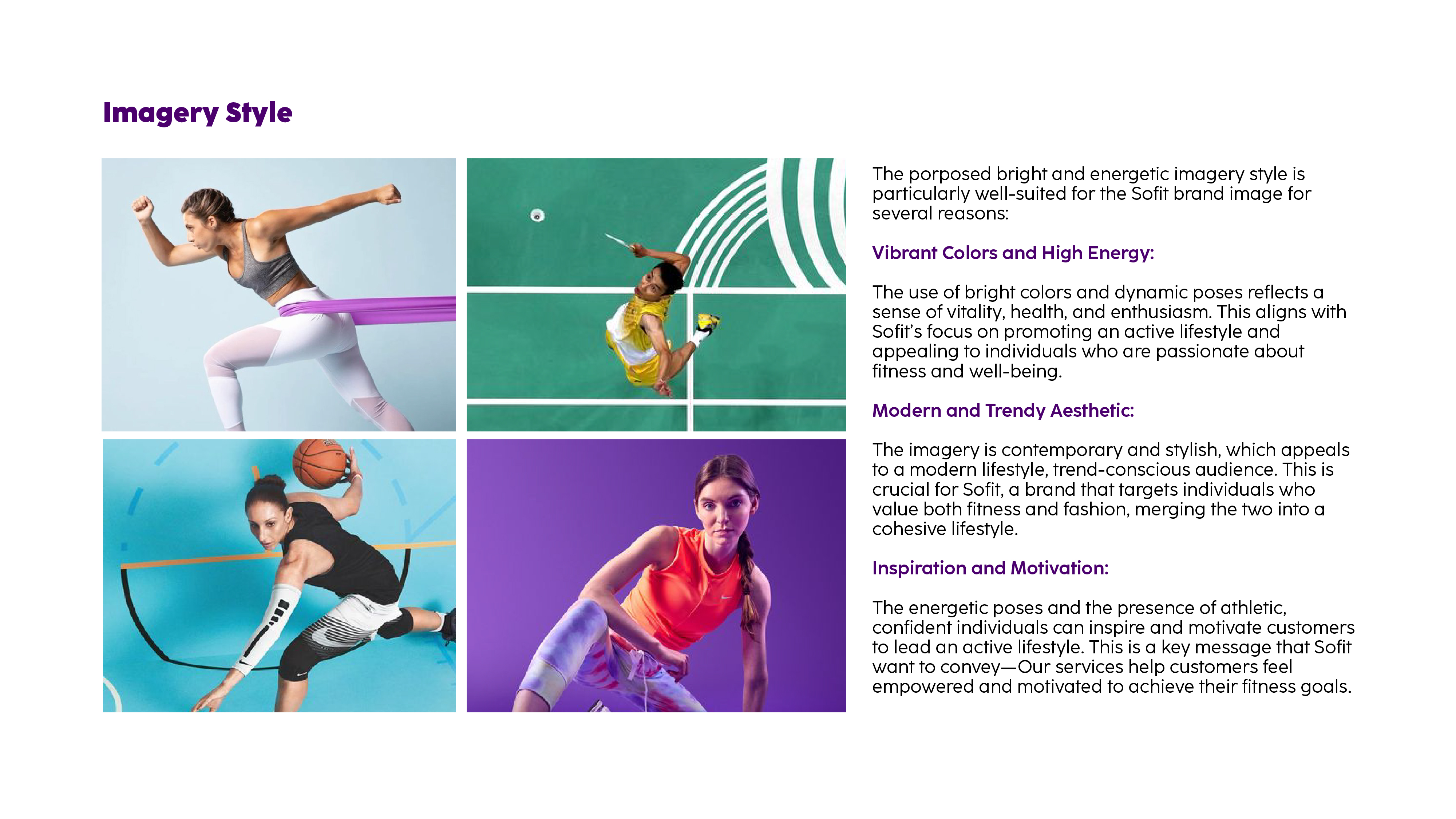
A Vibrant and Energetic Brand Aesthetic
For So-Fit’s brand imagery, we propose a bold and dynamic visual style, based on the following key considerations:
Vibrant Colours & High Energy
Bright colours and dynamic compositions convey a sense of vitality, health, and enthusiasm, perfectly aligning with So-Fit’s commitment to an active lifestyle and attracting those passionate about fitness and well-being.
Modern & Trend-Conscious Aesthetic
The contemporary and stylish approach ensures relevance in today’s fitness and fashion landscape, appealing to a modern audience that values both aesthetics and performance. So-Fit’s identity is not just about fitness—it is a lifestyle choice.
Inspirational & Motivational Appeal
The use of strong, confident poses and athletic figures reinforces the brand’s message—empowering customers to feel strong, capable, and motivated. So-Fit’s services are designed to inspire and drive individuals to achieve their fitness goals.
Through this visual evolution, Nakaya & Co. is proud to help So-Fit establish a strong, distinctive, and compelling brand identity, ensuring its message resonates with the market and solidifying its position as a leader in the fitness industry.
CLIENT
Sofit
Creative Director
Ron Ling