

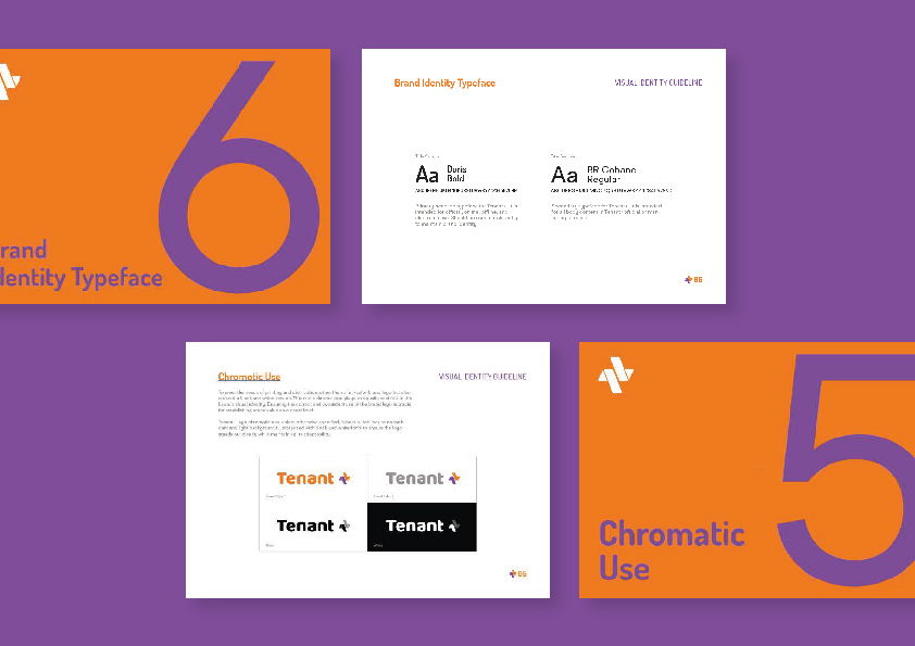

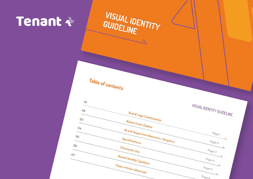
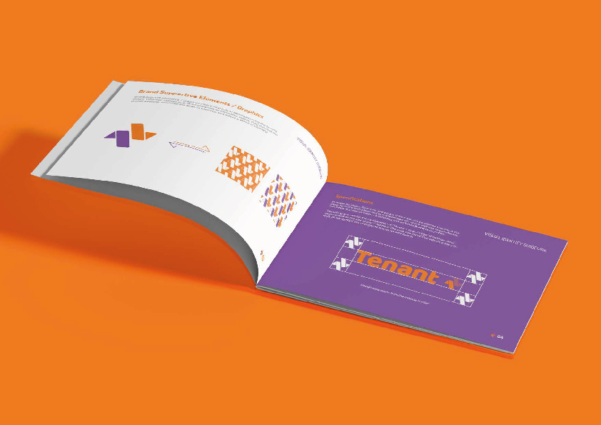
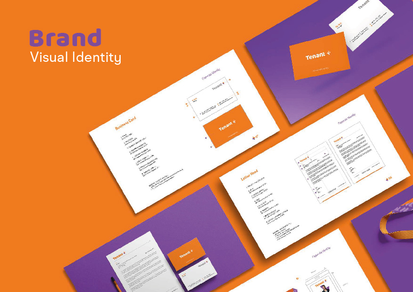
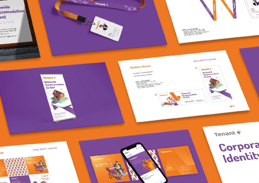
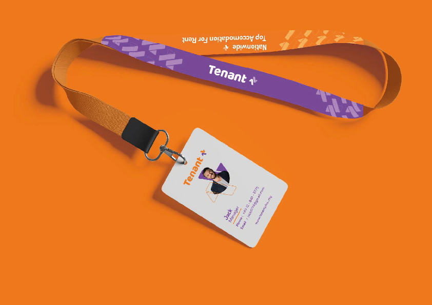
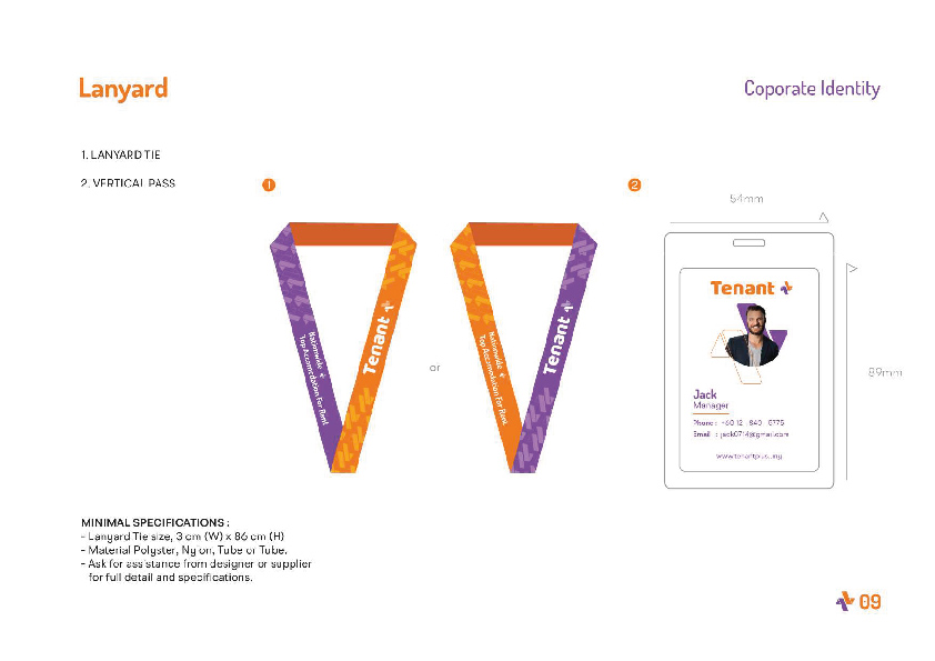
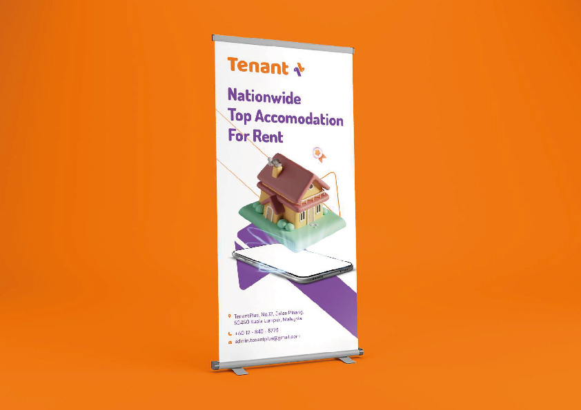
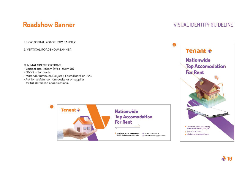
Brand Identity Development for Tenant +
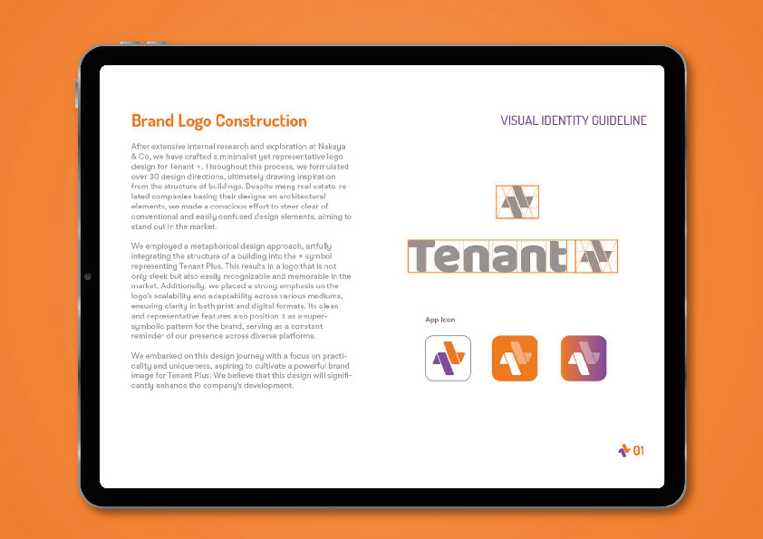
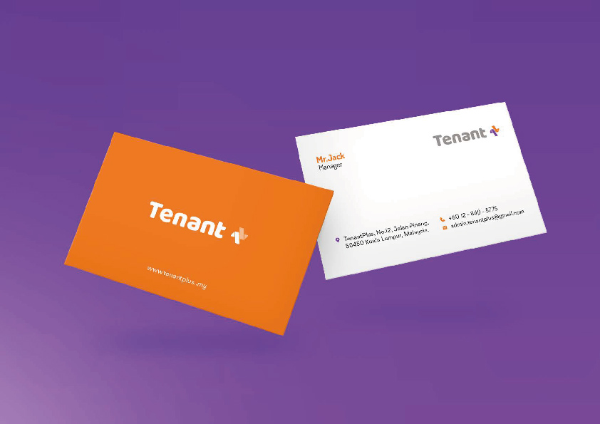
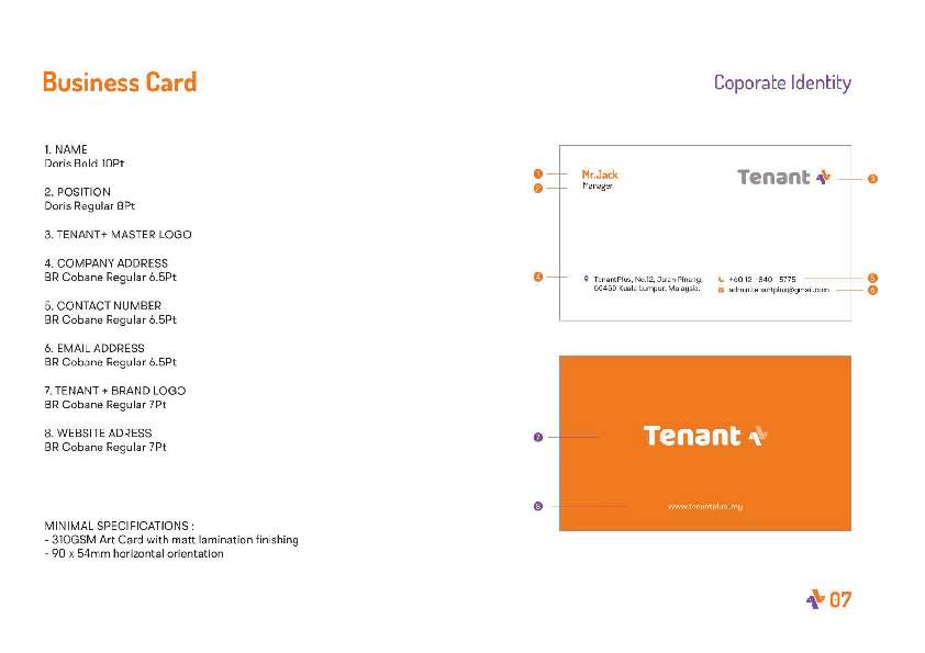
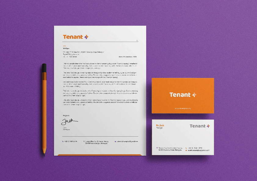
After extensive internal research and exploration at Nakaya & Co, Nakaya & Co have crafted a minimalist yet representative logo design for Tenant +. Throughout this process, Nakaya & Co formulated over 30 design directions, ultimately drawing inspiration from the structure of buildings. Despite many real estate-related companies basing their designs on architectural elements, Nakaya & Co made a conscious effort to steer clear of conventional and easily confused design elements, aiming to stand out in the market.
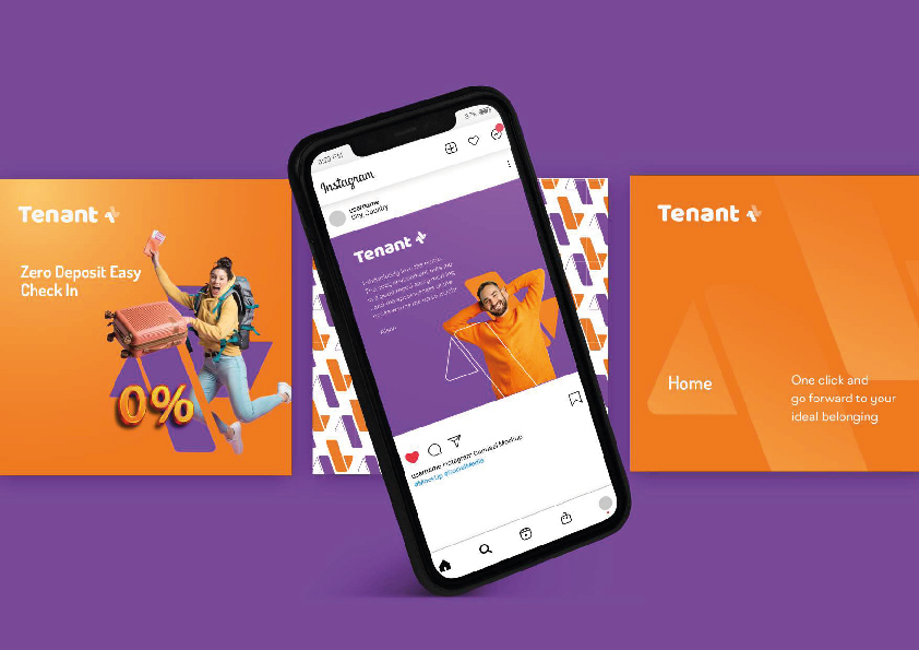
Nakaya & Co employed a metaphorical design approach, artfully integrating the structure of a building into the + symbol representing Tenant Plus. This results in a logo that is not only sleek but also easily recognizable and memorable in the market. Additionally, Nakaya & Co placed a strong emphasis on the logo's scalability and adaptability across various mediums, ensuring clarity in both print and digital formats. Its clean and representative features also position it as a super-symbolic pattern for the brand, serving as a constant reminder of Nakaya & Co's presence across diverse platforms.
Nakaya & Co embarked on this design journey with a focus on practicality and uniqueness, aspiring to cultivate a powerful brand image for Tenant Plus. Nakaya & Co believe that this design will significantly enhance the company's development.
CLIENT
Tenant +
Creative Director
Ron Ling
DESIGNERS
KaiJin