
Thong Kee Plus Branding
Nakaya & Co. is honoured to be invited to lead the rebranding of Thong Kee.
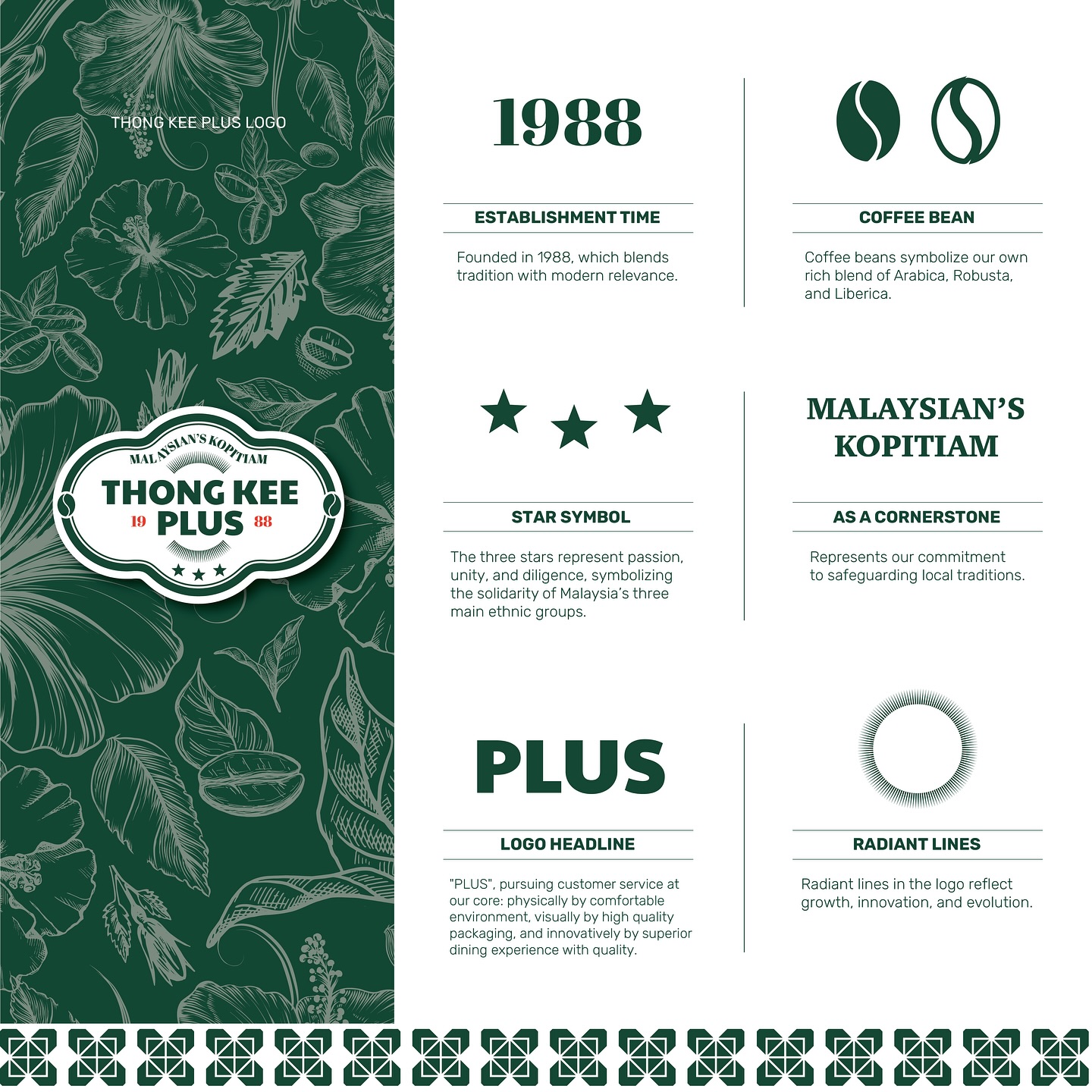
As one of Malaysia’s most beloved local brands, Thong Kee has upheld a philosophy of blending tradition with innovation since its establishment in 1988. The rebranding of Thong Kee Plus marks a bold new chapter — where timeless heritage meets modern revitalisation.
Brand Philosophy · Modern Spirit in Traditional Roots
The “Plus” in Thong Kee Plus stands for more than just an upgrade — it symbolises an elevated experience in service, environment, and quality. This rebrand centres around five key pillars:
Logo Reinvention: The year “1988” is integrated into the core mark, while three stars represent Malaysia’s major ethnic groups, symbolising unity, passion, and diligence.
Coffee DNA: Coffee beans take centre stage, honouring the legacy of Hainan coffee culture and the belief in freshly brewed, handcrafted beverages.
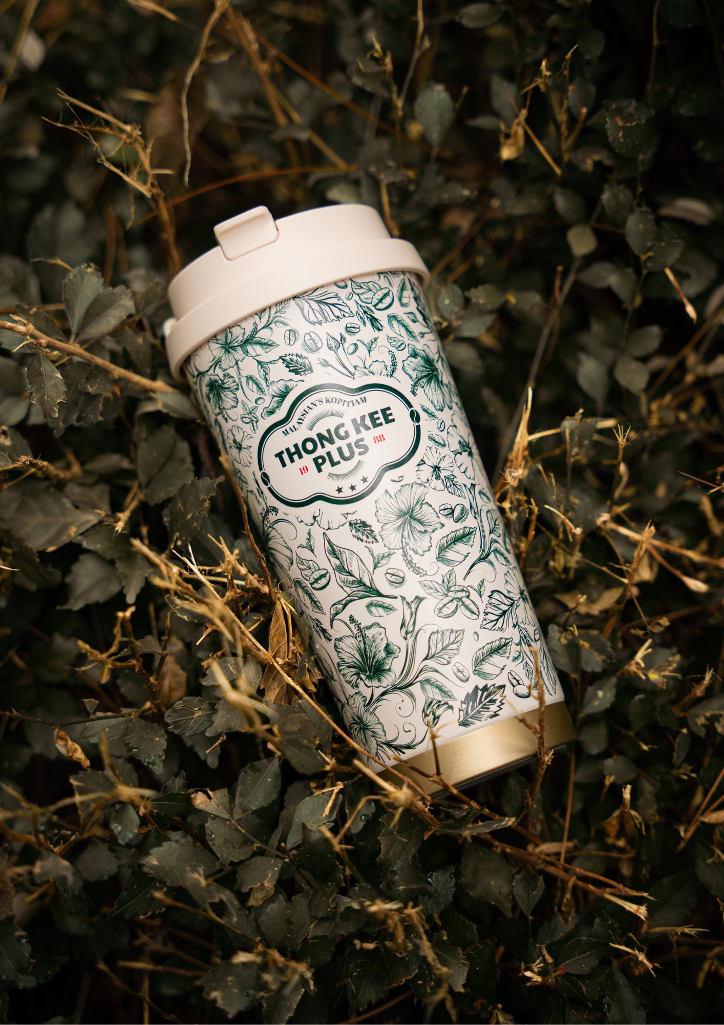
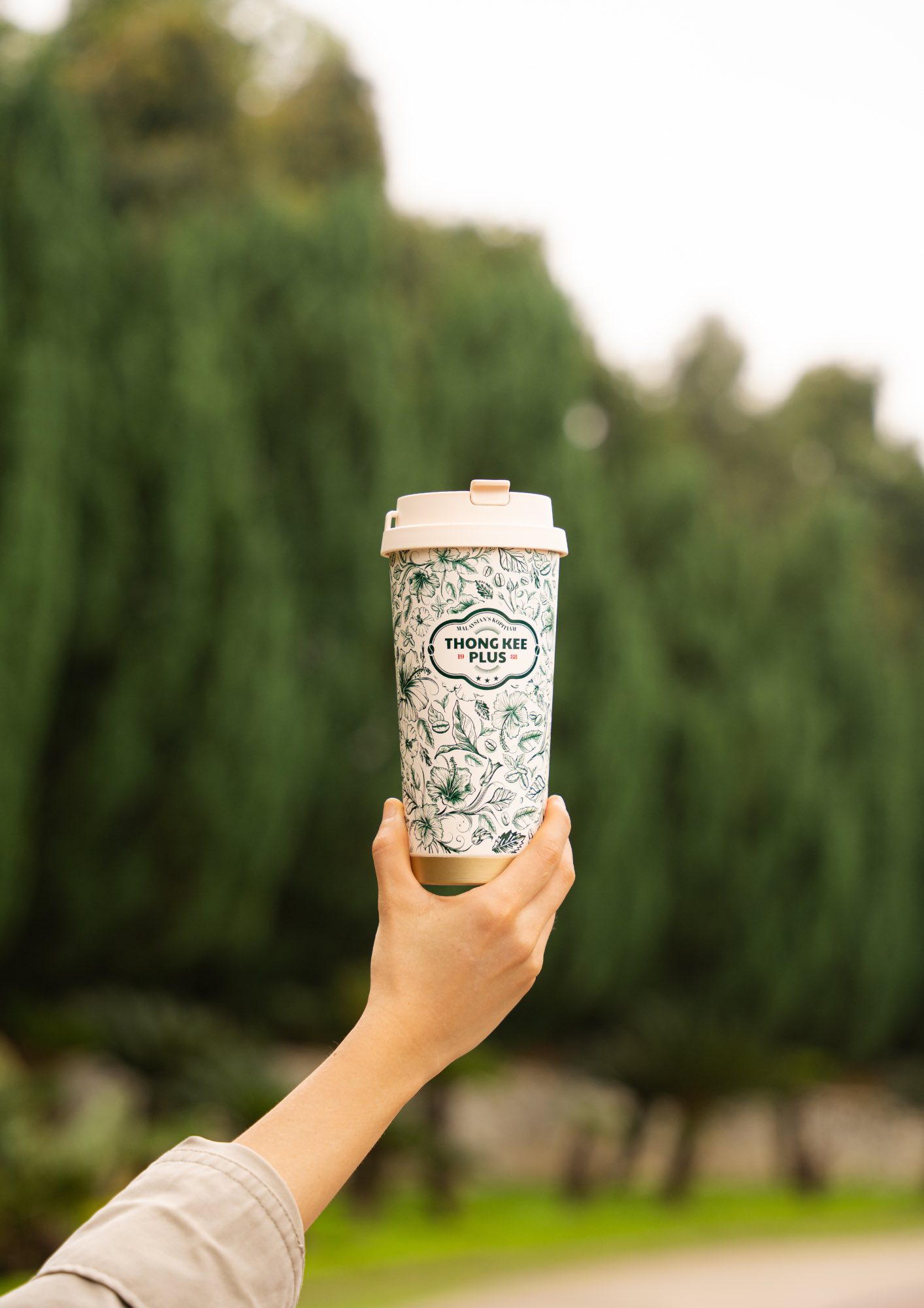
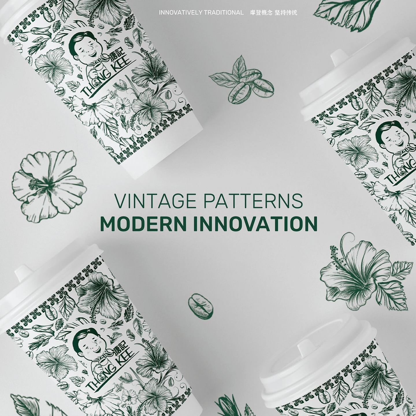
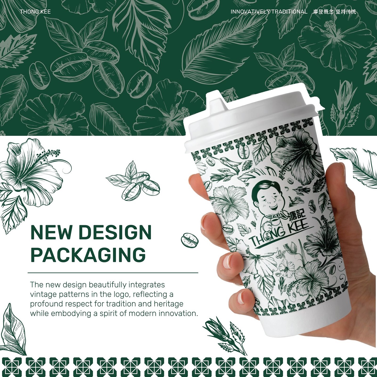
Visual Style Refresh: A hand-drawn style is used to reimagine motifs such as the hibiscus, coffee bean, and Hainan floral elements — paying homage to local cultural aesthetics.
Colour Language: A deep green palette anchors the identity, evoking a nostalgic, vintage feel that resonates with Malaysian taste memory.
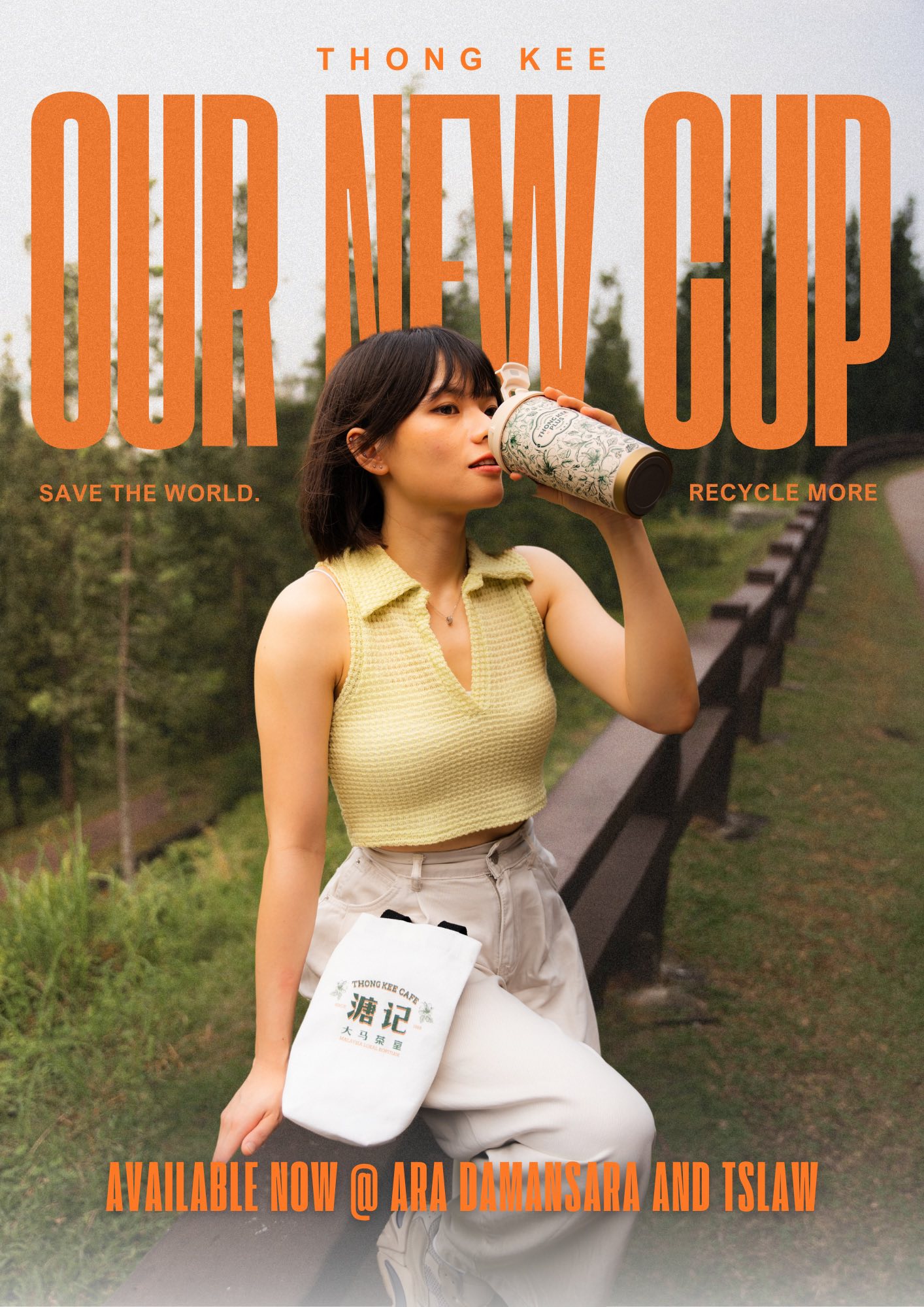
Signature Patterns: The intricate motif extends across cups, tote bags, and reusable drinkware, creating a recognisable and cohesive visual brand system.
Design Vision · Vintage Pattern, Modern Innovation
The packaging system is built around a seamless fusion of heritage motifs × contemporary structure:
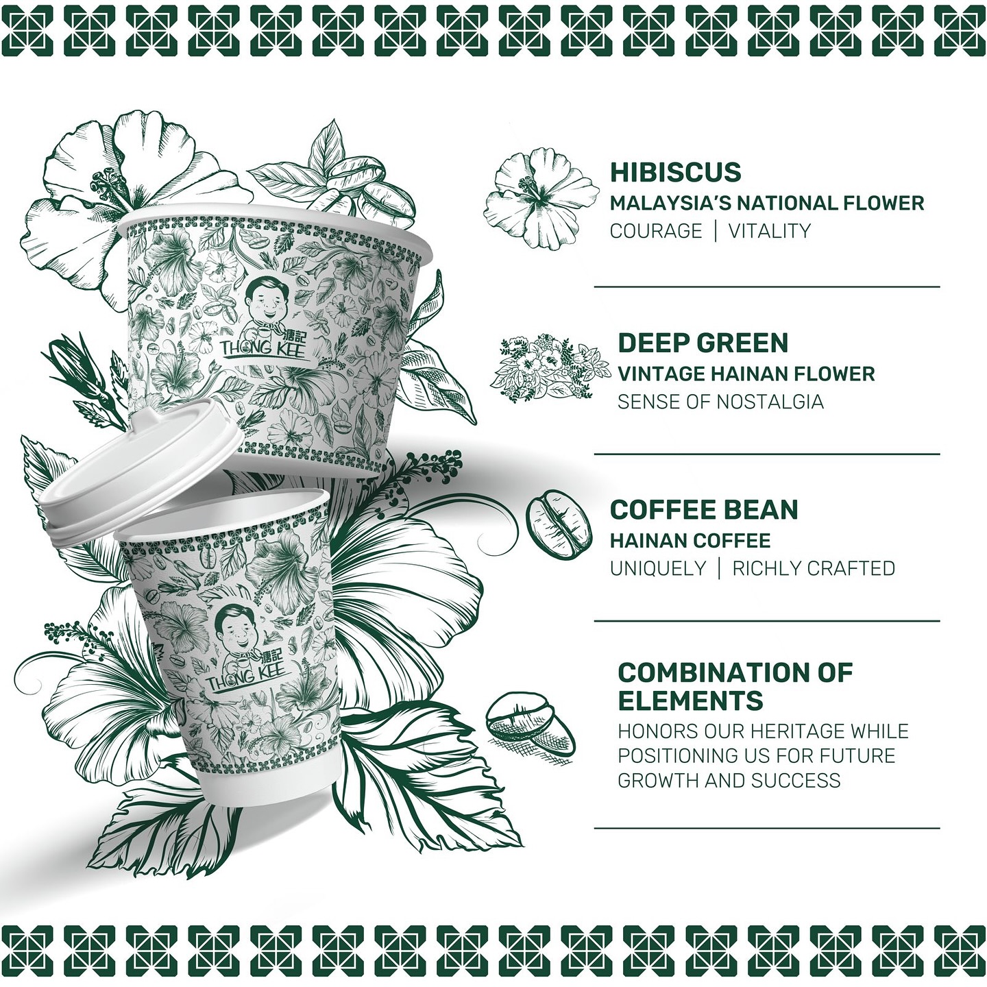
Element Selection: Featuring Malaysia’s national flower Hibiscus for courage, Hainan floral for nostalgia, and coffee beans for artisanal spirit.
Pattern Composition: Arranged like fine tapestry, the illustrations reflect Malaysia’s multicultural harmony and depth.
Use Case Expansion: The pattern flows across paper cups, tumblers, eco-bags, and digital collaterals — beautifully functional and sustainability-conscious.
Market Strategy · A Tribute to the Next-Gen Kopitiam
Thong Kee Plus is more than a cup of coffee — it’s a whole experience. With a refreshed visual identity, the brand redefines what it means to be a modern Malaysian kopitiam:
Redefining Space: Creating warm, comfortable spaces that connect emotionally with customers — becoming the “familiar corner” of the city.
Unified Brand Language: From packaging to store design and social presence, a consistent visual voice boosts recognition and brand recall.
A Brand Evolution That Resonates
Thong Kee Plus represents a contemporary revival of the Malaysian kopitiam spirit — where warmth meets aspiration. We are proud to witness and contribute to this journey of rebirth, where stories are told through patterns, and emotions conveyed through products.
CLIENT
Thong Kee
Creative Director
Ron Ling